Mixed Media Line Design Boards

This was the first step before beginning the entire process of creating the boards in the blog below. I found a picture of a landscape and drew the outline of the mountains and trees. This created the outline of one of my boards.

I created this using the outlined picture above trying to create the same line pattern that I drew out based off of the picture I found. I used black for the darkest shade then blue as a contrast to make it really pop out. The grey was used as the second to lightest color and white was used to fill in the brightest spots I noticed in the picture.

Using the same technique as above I used pictures and colors I created using mixed media to create a large collage of colors that would later be used for my final piece. I ripped up multiple pieces I created prior to this experiment and glued it to Deli paper using a gel medium.
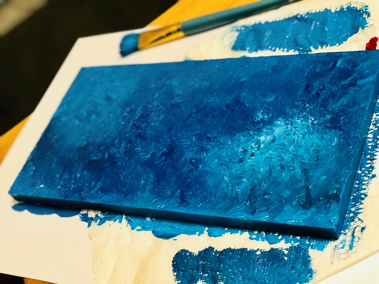
This is what my “cruciform” or “L” board looked like before laying out the collated pieces. I created this look using gesso and some high flow acrylic inks. I then dabbed over it with a paint brush numerous times until it got the effect I was going for.
 |
| This was the final piece that I ended up with after placing the collages pieces and some of my clay pieces I created in experiences before this design. |
 |
| This is just a different angle of the board above showing the way it looks from the side. The clay pieces come off the board giving a pretty cool affect. |
 |
| This is what my landscape board looked like before I glued on all of the collage pieces and before adding the trees. |

This is what the final piece looked like of my abstract board. I added trees using sparkling and then went over them with paint. The trees really added value to the final piece because of the 3D affect it gave off.

This is a side view of the abstract piece showing how the trees sort of look like they are coming off of the board.
If there is anything I’d change about creating the boards it would probably be the color so that it could look more realistic and relate to colors in the real world and nature. But I did love how bright it came out because I like creating pieces that are colorful and “happy” looking.

Comments
Post a Comment