Posts

Mixed Media Line Design Boards

Image
This was the first step before beginning the entire process of creating the boards in the blog below. I found a picture of a landscape and drew the outline of the mountains and trees. This created the outline of one of my boards. I created this using the outlined picture above trying to create the same line pattern that I drew out based off of the picture I found. I used black for the darkest shade then blue as a contrast to make it really pop out. The grey was used as the second to lightest color and white was used to fill in the brightest spots I noticed in the picture. Using the same technique as above I used pictures and colors I created using mixed media to create a large collage of colors that would later be used for my final piece. I ripped up multiple pieces I created prior to this experiment and glued it to Deli paper using a gel medium.  This is what my “cruciform” or “L” board looked like before laying out the collated pieces. I created this loo

iPad Design Apps

Image
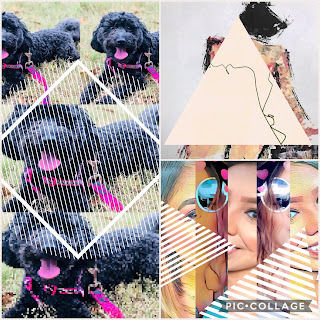
The following pictures below were all created on iPad apps representing different elements of design. Each picture contains a collage of 3 separate creations. The photo app used to create these collages is PicCollage .  The photo above was created to represent Rhythm using the app Spitpic . The photo above was created to represent Color using the app Pixlromatic . The photo above was created to represent Form using the app Pottery . The photo above was created to represent Line using the app Scribblify . The photo above was created to represent Pattern using the app KaleidoPaint . The photo above was created to represent Balance using the app Mirror Photo . The photo above was created to represent Shape using the app Daily Monster . The photo above was created to represent Space using the app Flow . The photo above was created to represent Texture using the app Glaze .

Design Experiments

Image
The following pictures below are individual Design Experiments that were created over the course of 2-3 weeks.  The piece above was created using a texture and going over a stencil with the texture. Once it dried I used acrylic paint to go over the dry texture. If I were to redo this experiment I would probably paint it a gold or bronze to make it appear ancient.  To create the design above I used foil and a stencil to imprint the swirls and circles. I then went over the stencil print with acrylic paint giving off a(n) ombre look.  The design above was also created the same way as the other foil imprint and then painted over with a thicker coat of acrylics. The imprint did not come out as visible as the 1st attempt which is why I went in with thicker paint to give it more detail.  Shaving Cream Design #1 Shaving Cream Design #2 Both Shaving Cream designs above were created the same way just with different colors. My favorite of the two is #2 because of how it res